A live estimate of the energy behind Britain’s building heat and cooling, by source — and how much can be saved when geothermal is adopted.
Live from grid and gas data where it can be measured; official annual figures shaped by the weather where it cannot. Estimates, not measurements. Methodology.
Every number here is computed from the live estimate below and restates with it. Daggers mark figures resting on Causeway judgement rather than a published source.
A weekly estimate of the energy behind Britain's building heat and cooling, by source — and how much can be saved when geothermal is adopted. Gas space heating is estimated live from grid data; other sources are official annual figures shaped by this week's weather. Estimates, not measurements.
Full technical methodology — equations, calibration figures, limitations, and a table of corrections found and declared since v7: UK Heat Split: data sources and estimation methodology, v8 (PDF). Currently under peer review.
† Current Causeway Energies estimate – challenge and input welcome at contact@causewaygt.com.
Gas (live). Daily gas offtake to Britain's local distribution zones (LDZ — the network serving homes and most businesses) is regressed against population-weighted GB heating degree days (ERA5 reanalysis via Open-Meteo). The temperature-sensitive component is attributed to space heating. Directly-connected power stations are excluded. Approach follows the published Watson/Sansom method. Current fit: —.
Everything else (shaped annual). Oil, electric heating, bioenergy, heat networks, solid fuel and cooling take their annual levels from the DESNZ ECUK 2025 End Use tables (calendar 2024) and are distributed across the year by heating/cooling degree days. They do not respond to live grid data. Cooling is the weakest element: the ECUK figure combines cooling and ventilation, split here 50% flat / 50% weather-shaped by assumption, and UK cooling demand is poorly measured. Electric heating counts the electricity into heat pumps, not the ambient heat they harvest — so the useful heat delivered by heat pumps is understated for now.
The two bars. The top bar is final energy — fuel and electricity purchased. The bottom bar is useful heat and cooling delivered: combustion derated by measured in-situ efficiencies (gas 83.5%, oil 82%, bio 70%, solid 55% — the last three are estimates), heat networks shown at delivered heat, resistive electric at 100%, heat pumps multiplied by a blended SPF of 2.8 (Energy Systems Catapult field data) with the harvested ambient heat shown in teal, and the weather-driven half of cooling multiplied by an assumed EER of 3. Heat-pump electricity is the ECUK 2025 domestic figure (2.0 TWh, 2024); non-domestic heat pumps are not yet counted, so the teal segment is understated.
Boiler efficiency, by end use. Space heating and hot water are converted at different efficiencies. A boiler serving only a cylinder fires in short bursts, cools between them, and returns water above the condensing dewpoint, losing its latent recovery: gas is 0.835 for space heating and 0.73 for hot water, oil 0.82 and 0.71. Both hot-water figures are the mean SAP 2012 Table 4b summer/winter ratio applied to the in-situ winter anchor, and SAP applies the summer figure to hot water in every month, not seasonally. Summer runs 82–89% of winter across that table. Bioenergy and solid fuel keep a single figure, because Table 4b does not cover them. The effect is that the effective gas efficiency now moves with the season — about 0.81 in January and 0.74 in July, when the load is almost all hot water.
Known biases. Hot-water heating is treated as flat but is mildly seasonal (colder mains water in winter), so gas space heating carries a small upward bias. Table 4b is SAP’s fallback for boilers absent from the Product Characteristics Database, so it is conservative and skewed to older plant; a PCDB-weighted fleet figure would beat it. Table 4c deducts 5 points where a regular boiler has no interlock, which is not applied here.
Geothermal panel. Today's heat figure is anchored on the EGEC 2025 UK Country Update (1,430 GWhth/yr from ~55,210 GSHP units, 847–861 MWth installed — a 2023 estimate from sales data; the Environment Agency's 2024 review suggests only ~30–38k of those units may be operational, hence the 1.4–2.0 range) plus ~0.07 TWh/yr from mine-water, deep and open-loop district schemes. No national metering or single register of ground-source systems exists; cooling is anchored only on 11 ATES systems (~8 MWth cold) and historic Southampton data. Forward bars are third-party pathways (CCC, Project InnerSpace/REA/ARUP) or explicitly flagged Causeway derivations, not predictions. The 2031 bar carries a range of roughly 3.5–6 TWh/yr. If the NI DfE licensing proposals (consultation to 7 Aug 2026; heat below 100 m depth) proceed, the resulting register with published system performance would be the UK's first mandatory geothermal data source — this panel is designed to ingest it from ~2027.
Northern Ireland, and the UK-to-GB step. NI is not on the GB network shown here. NI heating is estimated annually from subnational consumption statistics shaped by NI degree days, and that estimate now has a source: NIHE and BRE modelled NI domestic heat at 14.2 TWh (10,700 GWh primary space heating plus 3,500 GWh water) from the House Condition Survey, which is within 2% of the figure this site was already carrying. The annual figures behind every other series are UK totals from ECUK, scaled to GB per fuel. Until 17 August 2026 a single gas-network factor of 0.985 was applied to all of them, which is a statement about the GB gas grid and does not transfer. It was wrong for oil, where NI holds a far larger share than its population: NIHE put NI oil heat at 10.8 TWh on a 2016 basis, and the Irish sibling site estimates 8.3 TWh on a trailing twelve months — not a conflict but nine years apart, with NISRA showing the oil share of NI homes falling from 68% to 61% over that period. On the current basis NI holds about 17% of UK oil heat, so the shares are now per fuel: gas 0.988, oil 0.830, solid fuel 0.893, everything else the household share of 0.972†. GB oil heat falls about 16%. Found in peer review.
Indigenous share & 20% what-if. —
Calibration. —
| Route | p per useful kWh | Basis |
|---|
† = Causeway estimate – see Method & caveats.
| Route | gCO2e per useful kWh |
|---|
One fifth of Britain's heat, replaced three ways — air-source heat pumps, ground source, and geothermal networks — hour by hour across the last twelve months. Where the heat comes from decides how much electricity Britain has to find on its coldest hour.
One principle. National demand data shows slopes, not levels. A load that does not vary with the weather is indistinguishable from every other constant in the system, so no amount of grid data can size it. Every level on this panel therefore comes from elsewhere — official statistics for comfort cooling, bottom-up counting for process — and the grid’s job is to test whether those levels behave as they should, not to produce them.
The response curve below centres each day within its own month and day type before fitting. That removes the holiday and seasonal confound — August demand is depressed exactly when it is hottest — but it removes the level along with it, because the monthly mean contains most of the cooling. So the published curve recovers about a third of the anchored figure and is a lower bound by construction, not a contradiction of it. That share has moved as the estimator improved — it was a seventh before the binned ceiling was replaced by a continuous fit — so it is recomputed from the payload rather than quoted from memory†. Modelling the baseline explicitly instead — constant, day type, holidays, a heating limb and a convex cooling limb, fitted on undemeaned daily data — keeps the intercept, and recovers 74% of the anchor with a balance point of 14.5 °C against the 15.5 °C the building physics gives. Two independent routes within a quarter of each other. The gap is the honest uncertainty: it could be the anchor running high, the fit running low, or the shape being wrong, and 400 days cannot tell them apart.
Tier 0 was carried for months as a bare “of order 26 TWh a year” with no derivation anywhere. It now has one, and the exercise moved the number’s meaning more than its magnitude.
The food cold chain is anchored on Foster, Brown and Evans, Carbon emissions from refrigeration used in the UK food industry (International Journal of Refrigeration, 2023), which puts the entire UK food cold chain at 29.1 TWh of electricity on 2019 data. 10.75 TWh of that is domestic fridge-freezers and belongs in the household tier, not here. Stripping it out leaves 15–18 TWh: retail refrigeration 6.91, food service 4.16–9.28 (the widest single uncertainty), food and drink manufacturing 3.08, cold stores 1.32, agriculture 0.40.
Data centres are much smaller than their billing suggests. DESNZ’s June 2026 Energy Trends feature puts GB data centres at 4.5 TWh of grid electricity in 2024, 2% of the 249.2 TWh consumed. Cooling is only the overhead above the IT load: at a UK power usage effectiveness of 1.5–1.8 that is roughly 1–1.5 TWh. Trade press reporting 5.8% of national electricity is a capacity-based figure on a different scope, not the metered number†. Adding non-food industrial refrigeration — chemicals and pharmaceuticals at 0.88 TWh, from the DESNZ-funded TICR project — gives 17–22 TWh of electricity, or 25–45 TWh of delivered cooling once each component is converted at its own efficiency: supermarket display about 2 to 2.5, cold stores and manufacturing 2.5 to 3, data centre cooling service roughly the IT load it removes.
So 26 TWh is defensible as a service figure and wrong as an electricity one — and the site had never said which it was. It sits at the low end of the service range. Two cautions carried forward: the cold-chain data is 2019 and the retail figures trace to studies from 2007–2016, making this the stalest evidence on the page; and roughly 1 to 1.5 TWh of data centre cooling may already sit inside the ECUK services cooling line above, since data centres are services-sector buildings — a fifth of the anchor, potentially counted twice†.
The scale is the point. At 17–22 TWh of electricity, process cooling is three and a half to four and a half times the entire comfort-cooling anchor of 4.8 TWh. Britain spends far more electricity keeping product cold than keeping people cool, and none of it is in ECUK’s services cooling line.
The diurnal separation. Until 17 August 2026 this fold opened with a chart separating comfort from process cooling by hour: an overnight floor of 0.261 GW/°C rising to 0.676 at noon, offered as evidence that a continuously running refrigeration load is separable from daytime comfort cooling. It was an artefact. The demand series already contains embedded solar and the analysis added it a second time, which manufactures a correlation with temperature in exactly the daylight hours where a cooling signal would appear. Corrected, the profile is flat — 0.26 at 04:00 against 0.24 at noon, a ratio of 0.93 rather than 2.6. There is no daytime separation in this data. Tier 0 above is now supported by the bottom-up count alone, not by any grid measurement. Found in peer review.
Slope to level. Refrigeration power is
proportional to the lift, so a measured slope of demand against ambient
should integrate to a level without needing the intercept. It does not
work: below about 15 °C the night response goes flat, so the line
that would be extrapolated back does not exist. The method was withdrawn
rather than published.
An equipped-but-saturated tier. Latent demand minus delivered,
where latent extrapolated the low-CDD slope linearly. Its premise was
that the fleet flattens at high load. The measured response
steepens — about +3 GWh per CDD across the cool bins against
+17 across the warm ones — so the tier was structurally zero.
Saturation would show as a concave curve; this one is convex. Removed
11 Aug 2026, with the computation kept as a diagnostic: a non-zero value
would mean the curve had turned concave, which is the evidence that would
bring it back.
Humidity, on a test that could have failed. Latent load rises with absolute moisture, so moist-air
enthalpy days were a plausible explanation for the convexity. On the full
800-day record with embedded solar carried as a control, dewpoint adds
0.0006 to R² and enthalpy days add 0.0000 — against 0.031 for
bank holidays — and both return the same balance point as the base,
because there is nothing left for them to explain. The site’s stated
test is whether adding enthalpy absorbs part of the quadratic term: it
moves +3%. So the bend is the extensive margin — each
building a step, the fleet the integral of those steps — not latent
load. That test was capable of falsifying the reading: two earlier
mis-specified runs moved the quadratic by 25 and 27 points, in opposite
directions. It took three attempts to obtain a null worth having, after a
double-counted solar term, an omitted solar control that left moisture
proxying for it, and a workflow that fetched half the record†.
And three routes tried offline, not published here. Recovering the level that within-class centring removes was attempted five ways in all. Two more failed: fitting a balance point as the vertex of a V, which turns out to place its kink wherever the middle of the data is — the fitted vertex tracks each hour’s own mean temperature with R² 0.97 — and borrowing a level from the gas side, which establishes that balance points are spread across the stock but yields a shape without a scale. One remains open: comparing weekday with weekend demand at the same temperature, which gives 10 to 39% of the anchor and passes a night placebo. None is used in any published figure. All are documented in the methodology†.

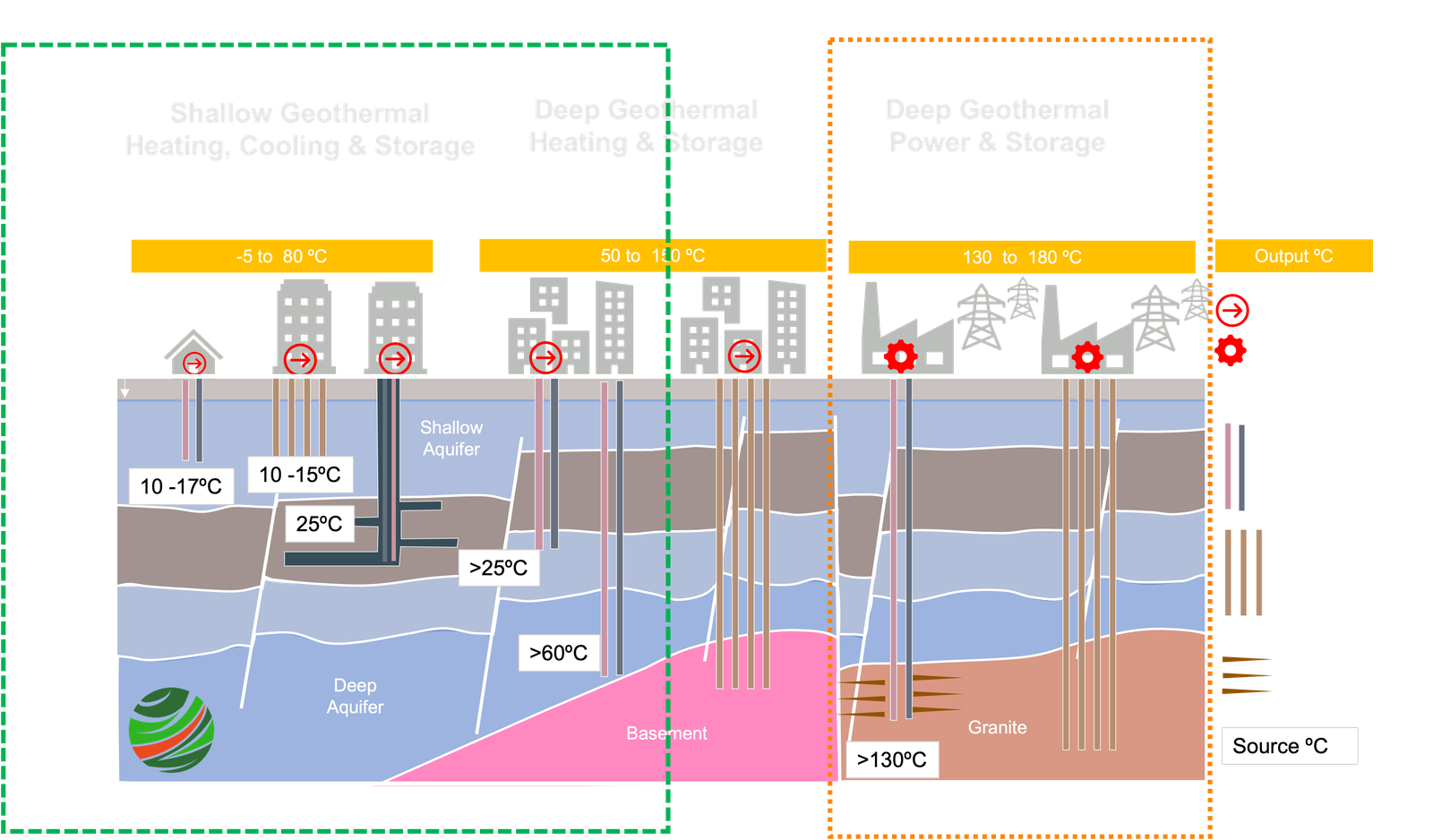
The site models heat and storage, not power. Everything inside the green boundary is in scope; the deep, high-temperature systems on the right are not, because their output is electricity and this site is about what heats and cools buildings.
Ground source (SPF 3.24) is the shallow column on the left — open-loop doublets, closed-loop borehole arrays and mine water energy, drawing on ground and shallow aquifers at 10–17 °C. It is modelled here as heat only or heat dominated: a source temperature of 8 °C after a 3 K brine approach, weather-compensated flow, and no credit for anything the ground gets back. That is deliberately the conservative end of what shallow geothermal can do, and it is the route with a monitored UK fleet behind it — the seasonal performance factor comes from Energy Systems Catapult in-situ measurement of more than 1,700 installations.
Geothermal network (SPF 5.0†) is a blend of two things in the figure. Shallow underground thermal energy storage on the left, where summer heat rejected by cooling and waste heat from data centres and other sources is banked in the ground and drawn back in winter; and intermediate geothermal — the hydrothermal direct-use column — where the geology suits it. Both feed a shared ambient loop with heat pumps at each building.
The difference between the two routes is mostly what the loop is sitting at. A network loop is modelled at 19.6 °C†, not the 8 °C of a passive ground array, because it is a charged loop: the cooling season and the rejected waste heat have put energy into it. That shortens the lift, which is what a heat pump’s efficiency actually depends on.
This is the least evidenced route on the site. There is no monitored UK network fleet to anchor an SPF against, so both the 5.0 and the 19.6 °C are Causeway estimates, and every network figure inherits them.
Both routes are first named in Section 3, “How far would electrified heat have sat against national capacity?”, and appear again in Section 2’s price chart and Section 6’s value case.
—